Our involvement in this virtuous path, leading to the construction of the building that houses the Castel’s Headquarters, sprung from the aspiration, shared by both the Client and the Contractor involved in the project, to seize this opportunity and transform it into something that went beyond the mere answer to the functional need to create office space. From the outset, we were committed to creating a design that, while being founded on a strong and clear affinity with a clear-cut functional project and a clearly defined organizational set-up, was able to identify deep-rooted concepts that could result in a design that stands out from the rest of the city.

A study of the context in which the building would be built was the key to this project. After analyzing the available area, it became clear that we could only use the part of the lot close to the boundary, facing the main road. This choice was therefore not due to the company’s desire to be self-congratulatory but was based solely on the fact that that this was the only space that could be used for the purpose. Indeed, the rest of the lot is devoted entirely to production and it would have been impossible to introduce another element in the dense network of production plants.
Therefore, the offices had to be built on the boundary, thus delineating the relationship between the innermost part of the lot devoted to production and the city. It would have been more obvious to decide to separate when, instead, it was decided to link production with the life of the city, expressing it in the form of the corporate building that would represent its presence with authority, no longer a series of functional additions within a lot that was identifiable only by a handsome old gate with the name and logo of the parent company, but with a building that could tell the story of the production going on behind it.
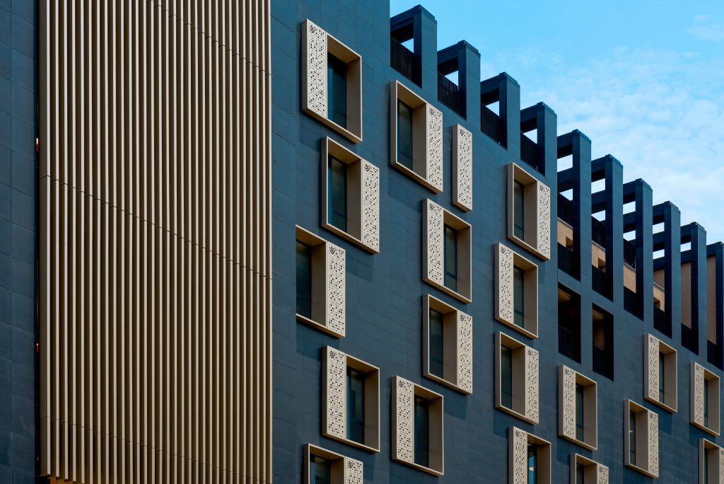
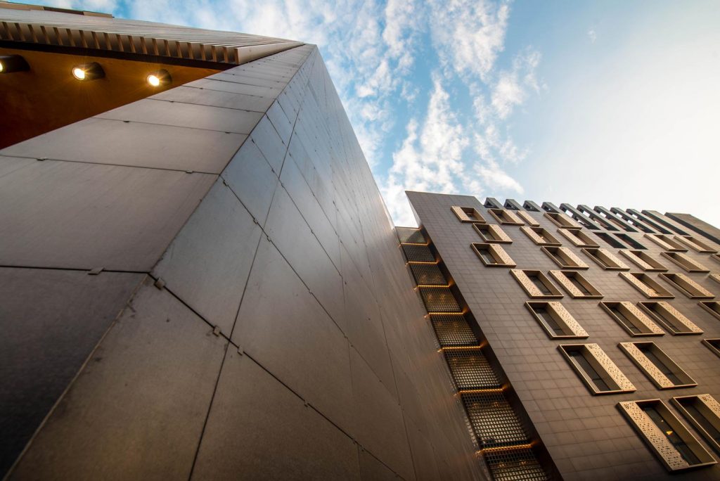
The commitment and responsibility we undertook were that of creating architecture that had a sense and not an image made merely of signs that wear out rapidly. Hence, the company’s product, the beer becomes the inspiration for a story of movement and color, of the amber liquid, that when poured into a glass swirls around and turns into waves of white froth. The aim was to capture this movement, embedding it in the façade of the building to define its sense. This translated into an elevation composition that uses the movement of the window fixtures and the color of the cornices to underscore this swirling color that beer produces. A particular pattern of holes on the screened section alongside the glass of the window fixtures was used to reinforce this concept. These holes, apparently randomly positioned, mimic, instead, the different diameters of the body of the beer bottle; this alternation, which symbolizes the random movement of the beer’s bubbles, merge at the top into the company’s logo, a bunch of grapes, thus uniting the two souls of the company, beer, and wine.
“A striking building; complex and vibrant, that contributes to enhancing the collective identity within a strongly interlaced landscape.”
In the meantime, in locating the accesses to the building, we reflected on what is the meaning of the action of “entering” in the Ethiopian architectonic culture. We immediately thought about the churches of Lalibela: the entrance through a perimeter space, connected to the outside by a very dark, narrow canal corridor, with the light at the end which illuminates the path. So, this image of moving through the darkness, only guided by light at the end was the idea based on which we designed the internal space, like a large dark sheet in which there is a vertical incision through which light shines. This translated into the large portal occupying the entire height of the building that marks, on the two fronts, therefore passing through the building, the entrance on the ground floor, and the terrace at the top, uniting the entire building in a single identifying unit.

In short, this is the train of thought underpinning the project; we wanted to understand how the image of a city could be defined responsibly, starting from ideas that make sense in that particular context. We didn’t want to simply differentiate this project from others in a sort of formal wishful thinking that loses significance at the very same time of its realization; for us, it was vital to appreciate the responsibility of defining an urban front already affected by the arrival of the new urban mobility infrastructure that allows a wide-angled cinematographic view over the city. This relationship with the new infrastructure was fundamental in defining the floor plan of the building, that shapes itself to fit in the stairwells and the lift, with a compositional mechanism that resulted in the integration of the two units, building, and stairway, in a fully harmonic way to seem inextricably connected in a unit that is both functional and formal.
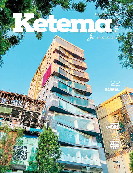
A FRENCH CLIENT, AN ITALIAN CONTRACTOR, AN ITALIAN DESIGNER: A EUROPEAN BUILDING IN AFRICA.
This project was possible thanks to the sensitivity and open-mindedness of a client that, while being far from the homeland, believed in an architecture that finally leaves an enlightened mark in an important city. But this would have not been possible without the cooperation of Elmi, a contractor that knew how to translate all the aspects of the project into something concrete, paying attention to the quality of the composition and to detail which, in complex projects like this, represents the real victory over an important challenge. In short, this is a project in which the quality of European culture has translated into a building that authentically manifests its significance as an element of dialogue and integration with a city that is full of potential. Finally, and particularly fascinating, is the fact that the construction of the entire building was made possible by supplies of materials that arrived in containers from Italy by sea and then by land. In short, it is a building with a close relationship with travel, that of the materials and the client that came here to work and that of their product that travels throughout Ethiopia.
ENGINEERING OF THE STRUCTURES AND SYSTEMS/PLANTS
This architectural project would not have been possible without close cooperation with the engineering firms that meticulously and courageously took up the challenge of such an important building. In terms of the structural profile, detailed studies were made of the behavior of the two units in the case of an earthquake, including the necessary structural solutions in the architecture without the typical exaggerations in one sense or another, but, instead, managing to open up to a fluid expression of the engineering of the needs and aims of the architecture. The same applies to the part of the project that concerned the ventilation and air conditioning systems, finding the right balance in their installation without exaggerating their presence in a context in which they are not typically used. As regards the electrical system, besides the typical factors in a building of this type, including the installation of backup generators, it was important to install mobile towers in the raised floor to figure in any future re-arrangement of the lay-out and thus make the building flexible in an aspect that traditionally becomes a constraint.
SPACE PLANNING
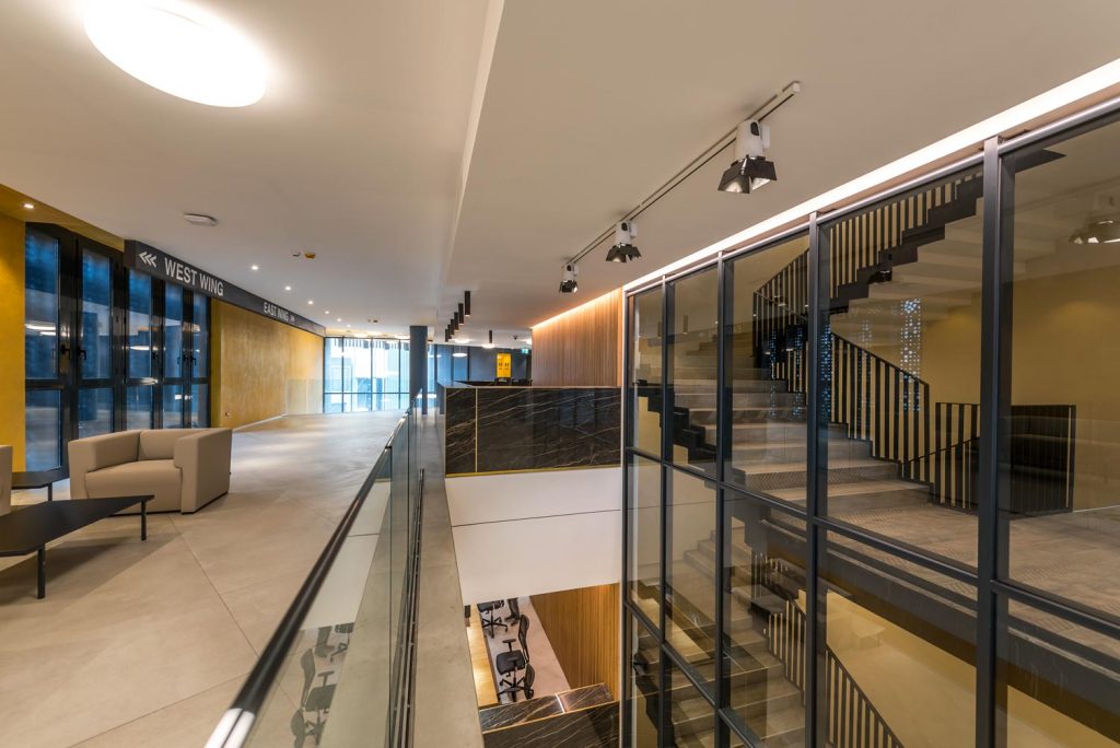
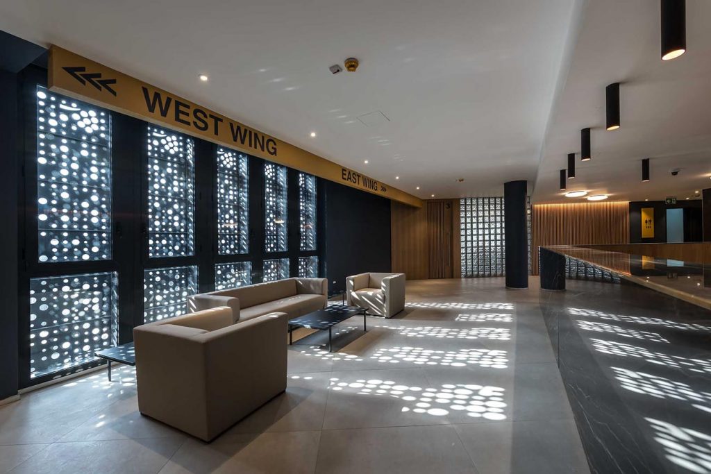
The basis of the project was the attention paid to a distribution layout that allowed accommodation in the building of the different working groups based on the company’s organizational chart and yet also guaranteed a clear distribution of the service functions inside the body of the building with a high level of efficiency in terms of the ratio between spaces used and paths. The clear distribution in two wings, east and west, that house the offices and the central unit, which has the role of absorbing the planimetric translation of the lot, with a concentration of service functions such as the main vertical connections with the stairs and lifts, the reception areas and secretarial offices on various floors, the restrooms, and the technical rooms. To ensure the functional independence of the residential areas on the sixth and seventh floors and at the same time offer the possibility of the necessary additional escape routes from the two office wings, two vertical volumes were designed with stairs and lifts, suitably separate from the two main units and formally used as the initial and end elements of the design, characterized by both the separation with the large vertical glass block wall and by the different finishing of the wall in reinforced concrete face view but painted in the same grey as the stoneware façade to uniform the difference.
FUNCTIONAL MIX
Another indication the client gave us was to think also about accommodation spaces that
could enrich the functional aspect of the project. In practice, including such different functions in the same building allowed us to propose a less traditional design for the façade. We decided to locate the living spaces at the top of the office building, using this different function as an opportunity to express a building-sky contact that dematerializes the continuous façade of the building in a sequence of terraces on one or more levels that chase what remains of the structure emerging with the force of its pillars that carve out the volume also in the top part, dematerializing the structure itself, all in the expectation that the greenery of the plants fills the vacuum that they have been offered to further demonstrate the profound approach to the project. Completing the functional mix, the residential use was accompanied by a large area dedicated to fitness on the sixth floor and a club for tastings of the beer and wine produced by the group with a terrace offering a view over the urban surroundings and the profile of the far-off mountains that surround the city.
THE CONSTRUCTION CHOICES
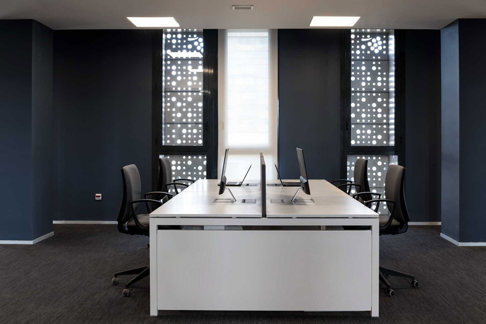
The first step was to identify a structural approach that would guarantee unequivocal integration of both the parking function on the ground floor and the offices and, finally, the living spaces on the top floor, enabling the active involvement of the structural element in the definition of the image, evident above all in the dematerialisation of the volume that on the residential floors remain a pure structure, giving harmony to the relationship with the sky. In an authentically convincing way, to qualify and translate the conceptual choices in a series of construction solutions that represent force, the project then concentrated on the façade and the relationship with the window fixtures. The façade was designed adopting a technical solution that guarantees ventilation and, in the meantime, could be made using the lightest materials, considering the relationship between the planned large surfaces and the need to limit the weight of the materials for transportation by container from Italy. The choice fell on a ventilated façade system using thin stoneware sheets, reinforced on the back with a fibreglass mesh to create a substantially continuous surface, colouring in the same colour the supports that act as a powerful but neutral background to the geometry of signs such as to allow the articulation of the windows to communicate their free movement and represent the flow of the beer’s froth. In practice, the dark background of the ventilated façade, with its own continuous and fixed geometric rhythm, is like a matrix on which the golden cornices of the windows alternate. These have been made with different types based on unitary construction criteria and making use of multilayer aluminium that, appropriately pre-cut, allowed it to be produced in Italy and transported in large sheets that were then assembled on-site before installation. The aluminium sheets were of a colour that reflects the nuances of beer and its froth; a colour that synthetically, but not didactically, reflects it. To underscore the volumetric elements that define the building, the side stairs and the two office units are connected to the central unit by vertical high translucent glass block partitions, which strongly contrast the opaqueness of the dark, ventilated façade. This effect is even more evident in the transition from daylight to dusk when the glass walls, thanks to led strips that eliminate the physical presence of each stringcourse on which they are mounted, become large vertical lights on the scale of the entire building.
INTERIOR DESIGN
The design scope included the Interior Design Work Package; mood boards for every area of the building have been delivered to meet the overall architectural frameworks. To meet deliveries & cost requirements, the Contractor opted to manufacture locally both the Offices & Apartments in-built Furniture Packages, granting as well the flexibility required in the implementation phases. Particular attention has been given to the Lighting & Signage design works.
LIGHTING
The entire building was the subject of a detailed lighting engineering study that guarantees flexibility of the office functions in terms of light distribution, without binding solutions, opting for a regular grid of led panels that offers uniformity of the light, enabling the free positioning of workstations. At the same time, the common spaces in the central unit, the reception on the ground floor with double height connected to the first floor, and all the secretarial offices on the various floors have been designed with regularly distributed lighting systems above the counters and irregular elements to highlight the exceptional nature of the space. As per the initial concept, we designed the lighting system to strengthen the effect of movement and rhythm of the windows matrix, which becomes the architectonic representation of the sparkles in beer.

SIGNAGE & WAYFINDING
To guarantee safe and informed movement within the building, a spatial orientation system was designed, complete with different types of panels, both freestanding, ceiling-mounted, and wall-mounted. They have all been designed complying with international graphic standards, to perfectly integrate with the interiors.